Paylocity UX/UI Modernization — Citrus Design System
From 'C+' UI to a modern, governed design system that scaled across a multi-product HR platform.
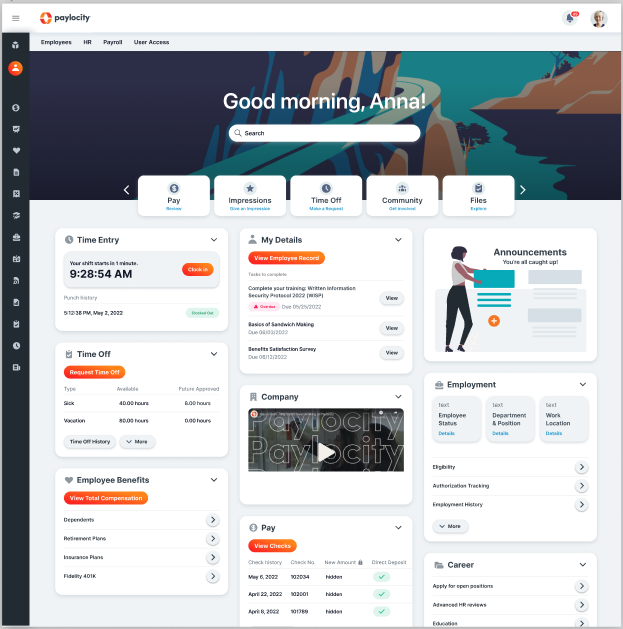
Helped lead the UI modernization that unified Paylocity's suite around the Citrus design system, contributing shared patterns, components, and a five-dimension brand-to-UX framework.
TL;DR
Challenge → Approach → Results
Challenge
A fast-growing product suite with inconsistent UI, fragmented patterns, and no shared system made it hard to ship quickly without quality trade-offs.
Approach
Contributed to Citrus design system foundations (tokens, components, and patterns) for core HR and collaboration surfaces. Created a five-dimension brand→UX framework to align visual language, interaction patterns, and content tone.
Results
Cohesive modern UI across 15+ SaaS products instead of fragmented experiences. Improved delivery velocity and perceived product quality by replacing ad-hoc UI with governed, reusable patterns.
Outcomes
- Cohesive modern UI across 15+ SaaS products
- Improved delivery velocity and perceived product quality
- Citrus design system with tokens, components, and patterns
- Five-dimension brand-to-UX framework
- Team scaling (3 additional designers)
Strategic Context & Challenge
The Design Debt Crisis
Current state assessment: “C+” - Paylocity’s interface had accumulated significant design debt across multiple product areas. The critical finding: “The UI feels dated with boxy widgets, heavy drop shadows, and inconsistent design patterns. There is also a large variety of typography, which shows the lack of attention to detail.”
Systemic Problems Identified
- Visual inconsistency: Conflicting old and new styles creating fragmented user experience
- Component chaos: Inconsistent data tables, page tabs, and navigation patterns
- Typography sprawl: Multiple typefaces and hierarchies lacking systematic organization
- Accessibility gaps: Insufficient color contrast risking WCAG compliance
- Mobile inadequacy: Imprecise spacing and components failing modern device expectations
Innovation: Brand-UX Alignment Framework
Five-Dimension Translation Model
My team developed a systematic framework translating Paylocity’s brand dimensions into concrete UX implementation guidelines:
| Brand Dimension | Brand Expression | UX Implementation |
|---|---|---|
| Casual | Eye to eye, no jargon, simple language | Meet user at comfort level, friendly, conversational |
| Lighthearted | Set customers at ease, fun | Safe and comfortable, reduce friction, easy interactions |
| Practical | Savvy but straightforward, informative but informal | Mobile first, systematic, build familiarity, efficient |
| Personable | Empathetic, instilling confidence | Reliable, relevant, empathetic, value-adding |
| Culture-forward | Big picture, future looking, people centered | Consumer grade for enterprise tasks, inclusive, accessible |
Strategic Philosophy
“Create a modern user experience that echoes organizational culture” - moving beyond functional interfaces to emotionally resonant experiences that reinforce Paylocity’s brand values in every interaction.
The Citrus Design System
Systematic Design Foundation
I helped lead the overhaul of “Citrus” - a comprehensive design system establishing consistency across the entire platform:
Core Foundation Elements
- Design tokens: Systematic color, spacing, typography, and elevation scales
- Component library: Reusable interface elements with clear usage guidelines
- Accessibility standards: WCAG-compliant color systems and interaction patterns
- Mathematical spacing: Consistent layout rhythm across all interfaces
- Brand integration: Visual identity systematically embedded in every component
Implementation Strategy
- Base kit creation: Foundational elements establishing design principles
- Component specifications: Detailed guidelines for consistent implementation
- Cross-platform consistency: Unified experience across web and mobile
- Governance framework: Guidelines for system evolution and contribution
Mobile-First Design Strategy
Responsive Reality
Recognized that mobile optimization requires fundamentally rethinking information architecture, not just responsive layouts. Key features reimagined for mobile-first experience:
Reimagined Experiences
- Targeted Post Box: Streamlined social posting with audience selection and rich media
- Team Groups: Illustration-led welcome surveys and team introductions
- Quick Actions: Icon-based task shortcuts prominently positioned
- Contextual Content: Personalized greetings and role-appropriate information
Design Principles
- Touch-first interactions: Controls optimized for finger navigation
- Progressive disclosure: Essential information prioritized for small screens
- Contextual hierarchy: Information architecture adapting to usage patterns
- Performance optimization: Fast, responsive interfaces across device capabilities
Visual Language & Illustration Strategy
Optimistic & Personable Approach
Developed comprehensive visual system creating emotional connection through purposeful design choices:
Color System
- Primary: Paylocity Orange (#FF6B35 range) as brand anchor
- Secondary: Soft teal/turquoise (#7BCCC4) providing visual balance
- Supporting palette: Warm grays, purple accents, soft beiges
- Application strategy: Color blocks with beige emphasis for warmth
Typography & Form Language
- Button design: Slightly rounded corners with flat, accessible approach
- Shadow strategy: Minimal elevation maintaining clean aesthetics
- Iconography: Outlined, medium weight, linear, playful consistency
- Overall aesthetic: Clean, contemporary, accessible
Illustration Philosophy
- Style: Hand-drawn, sketchy, dark linework with muted color fills
- Character approach: Diverse workplace representation
- Emotional tone: Optimistic, human-centered, approachable
- Brand differentiation: Unique visual identity in commoditized software landscape
Comprehensive Competitive Analysis
Systematic Component Audit
Conducted detailed analysis of current state across all major interface elements:
| Component Area | Current Rating | Issues Identified | Improvement Priority |
|---|---|---|---|
| Visual Consistency | Medium | Conflicting old and new styles | High |
| Color System | Medium | Insufficient contrast, accessibility gaps | High |
| Typography | Medium | Multiple styles, dated appearance | High |
| Iconography | Medium | Two conflicting icon systems | Medium |
| Page Layout | Medium | Inconsistent grid systems | Medium |
| Mobile Experience | Medium | Imprecise components and spacing | High |
Implementation & Team Strategy
Phased Rollout Plan
Near Term (May-June 2022)
- PSC presentation: Strategic direction confirmation and executive alignment
- Style exploration: 2-3 desktop & mobile page demonstrations
- Design system foundation: Citrus base kit creation
- Navigation exploration: Main menu and information architecture optimization
Q4 2022 & FY23 Expansion
- Team scaling: 3 additional designers dedicated to UI system updates
- Quick wins implementation: CSS and icon updates across codebases
- Major rebuilds: Mobile re-platform, login redefinition, high-traffic experiences
- “Moments that matter”: Focus on experiences with highest user traffic
Resource Planning & Coordination
- Cross-functional alignment: Engineering partnership for implementation feasibility
- Brand collaboration: Marketing team coordination for brand integrity
- Illustration vendor management: External specialist partnership
- Performance optimization: Technical requirements for improved user experience
Technical Implementation Strategy
Systematic Updates
- CSS harmonization: Cross-codebase style unification
- Component standardization: Unified interface element library
- Design token implementation: Systematic color, spacing, typography scales
- Accessibility compliance: WCAG 2.1 AA standard achievement
Major Architectural Changes
- Mobile re-platform: Complete mobile experience reconstruction
- Login system redefinition: Authentication flow modernization
- High-traffic optimization: Performance improvements for most-used features
- Progressive enhancement: Graceful degradation across device capabilities
Business Impact & Strategic Value
Competitive Positioning
- Market differentiation: Visual and experiential distinction from HR tech competitors
- Brand reinforcement: Every interaction reinforcing Paylocity values
- Talent attraction: Modern product attracting top design and engineering talent
- Customer experience: Consumer-grade expectations met in enterprise context
Operational Excellence
- Development efficiency: Shared components reducing build time
- Maintenance reduction: Centralized design updates
- Quality consistency: Systematic approach preventing design debt
- Scalable design operations: Framework enabling rapid feature development
User Experience Transformation
- Cognitive load reduction: Predictable patterns reducing learning overhead
- Emotional engagement: Personality and delight in business software
- Accessibility improvement: Inclusive design expanding user base
- Mobile optimization: True mobile-first experience for modern workforce
Innovation & Methodology
Design System as Strategic Asset
Citrus represents more than visual consistency - it enables scalable design operations and brand expression:
- Component reusability: Faster feature development through shared elements
- Cross-platform consistency: Unified experience across web, mobile, future platforms
- Maintenance efficiency: Centralized updates propagating across all experiences
- Brand as experience: Visual identity that resonates with SMB culture
Future-Proofing Strategy
- Flexible foundation: Design tokens adapting to emerging brand directions
- Accessibility evolution: Proactive compliance with evolving standards
- Technology adaptation: Component architecture ready for new frameworks
- Systematic scalability: Framework supporting organizational growth
Leadership & Cross-Functional Impact
Strategic Design Leadership
Led comprehensive transformation requiring coordination across multiple disciplines and stakeholder groups:
- Executive alignment: PSC presentation securing strategic direction and resources
- Team development: Scaling design organization with systematic hiring plan
- Cross-functional coordination: Engineering, product, and brand team collaboration
- Vendor management: External illustration partnership coordination
Change Management
- Stakeholder education: Building understanding of design system value
- Implementation planning: Realistic timelines balancing impact and feasibility
- Quality assurance: Governance frameworks ensuring system integrity
- Success measurement: Metrics validating transformation effectiveness
Key Insights & Lessons
Strategic Insights
- Systematic approach essential: Comprehensive analysis before design work prevents reactive solutions
- Brand-experience alignment: Framework translating brand values into concrete interface decisions
- Mobile-first necessity: Responsive design insufficient - requires architectural rethinking
- Illustration as differentiation: Emotional connection through purposeful visual personality
- Design system investment: Strategic business asset, not aesthetic preference
Implementation Learning
- Phased rollout success: Quick wins building momentum for major transformations
- Team scaling critical: Dedicated resources essential for systematic implementation
- Cross-functional partnership: Engineering collaboration determining feasibility and success
- Governance frameworks: Clear guidelines enabling contribution while maintaining quality
Legacy & Evolution
The innovations developed for Citrus—systematic design tokens, the five-dimension brand-to-UX framework, and the focus on multi-product governance—served as the direct philosophical precursor to OODS Foundry.
While Citrus established the need for shared language, OODS Foundry evolved these concepts from human-centric documentation into agent-native “Trait Composition,” moving from static components to deterministic business objects.